Instacart
The same apple across every store, in one unit, side by side, with an AI you can just ask. A concept.
- Role · Sole designer
- Year · 2023–24
- Tools · Figma
Brief
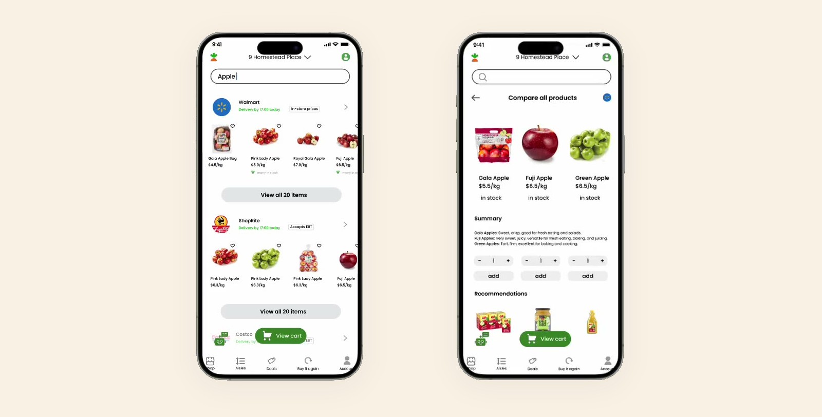
Instacart lets you shop eight supermarkets from one couch, but never against each other. $4.50 a kilo here, $5.66 for three pounds there, never side by side.
How might we compare products by price and quality, and recommend from what you like and what you can spend?
Research
I mapped the shopping flow, then the branch Instacart lacks: comparison, by filter or by budget.
Then I asked three shoppers. They wanted less than I expected.
What that adds up toIn different words, all three asked for two things: a price in a unit they can hold against another, and the app remembering what they like. None asked for more filters. That set the goals.
Three goals- Easy comparison. Smooth and intuitive, never a spreadsheet.
- Enough information. Enough to decide on, and no more.
- Bendable options. Comparisons you can shape, by filter or by budget.
- Clear price comparisons, more ways to search, add straight from the comparison, and personalisation. Not over-filtering, not stale information.Shopper 1
- Remember my shopping preferences. Show detailed images and descriptions. Give price and quality a score I can read.Shopper 2
- Keep it simple. Show the unit price and a nutrition rating.Shopper 3
Wireframes
Two flows, drawn grey so only the structure argues.
Compare. One new button on the product page, and the sheet it opens.
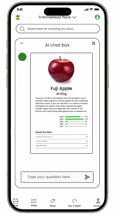
Ask. A chat in the corner: “some apples, low price” comes back as four cards.
Iterations
Four passes, each fixing what testing broke. The second is the one that matters: every price in one unit.
Same three apples, two ways to read the price- Gala Apple Bag $5.07 1.36 kg bag
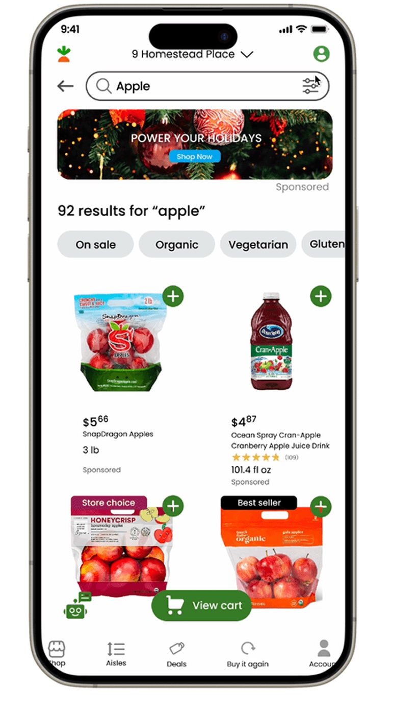
- Honeycrisp $4.87 2 lb bag
- Fuji Apple $6.50 loose, per kg
-
Clarity
Filters as a row of chips. Every card lost a line and gained a price you can read at arm’s length.
-
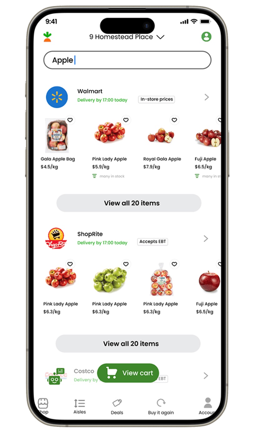
One unit, grouped by store
Every price also shown per kilo, and results grouped by store, so choosing between stores happens on one screen.
-
Ask
A sentence instead of a search term. “Cheap apples for a pie” comes back as a card you can add.
-
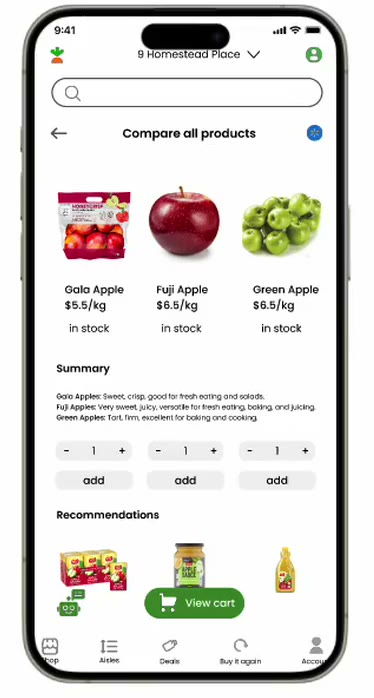
Compare, side by side
Up to three, lined up: photo, price per kilo, stock, one line each, and an add button under every column.
Outcome
A clickable prototype in Figma: search, filter, compare, ask. A concept, done on my own, not with Instacart.
Not yet testedWhether shoppers trust a per-kilo price on a bagged product, and how many items a compare sheet holds before it turns into the spreadsheet the brief warned against. Both are next.
ReflectionToday the search bar itself would take “cheap apples for a pie” and come back with a comparison, not a list.